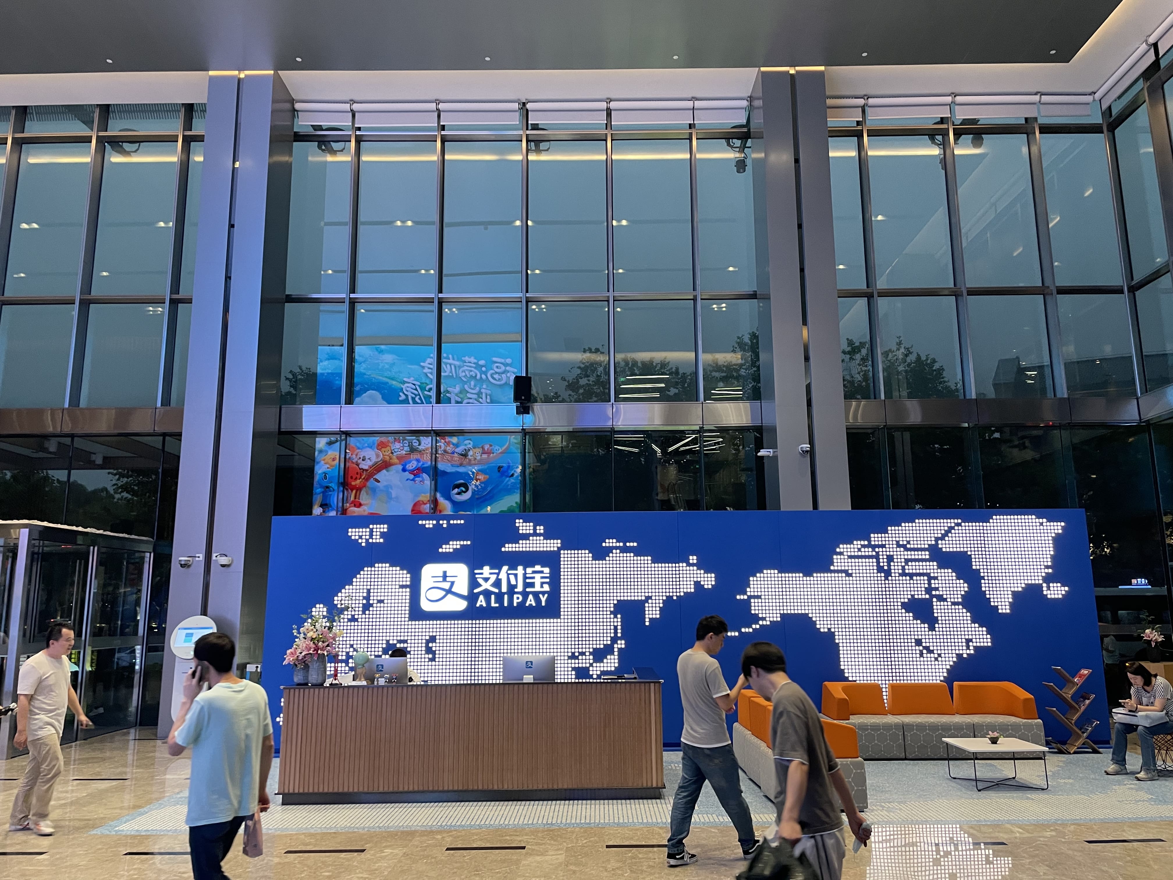
Alipay Investment AI Chatbot
Enhance discoverability and relevance of robo-advisory experience to grow user base
Type
Internship
Team
Intern designer (me) +
1 designer + 1 PM +
4 developer

Content has been translated in this image (originally in Chinese).
My contribution
Redesigned flow and key components
As a result of my 3-month internship, my main contribution included:
Ideated, prototyped, and launched redesigns on conversation flows, in-chat components, and entry points
Facilitated several review sessions with cross-functional stakeholders
Participated user studies and gathered findings with researchers and business analysts

Timeline of this project (5.5 weeks out of 12 weeks of my internship)
In addition, I also contributed to a vision design on in-chat investor education, which will not be covered in this case study.
NOTE: To comply with the NDA, specific confidential details have been excluded in this case study. Please feel free to reach out and I'd be more than happy to chat about it privately.
Problem
Poor engagement rate and stagnant user growth
With the background of slow increase in user base, the chatbot team has also found that the first-time users who entered the chatbot were highly likely dropping off before taking any actions after first round greeting.

Funnel chart of conversion
To resolve this problem, the team has made several product strategies including partnering with Conservative Product Team to deliver their low-risk products to users to close gaps of both financial ability and knowledge.
How might we make our chatbot discoverable, relevant, and well-informed for novice investors?
Solution
Enhance in-chat conversation relevance and out-chat discoverability for novice investors
The redesigned first-time conversation flow for novice investors is comprised of the following:
Design 1 | Redesigned in-chat actionables
Redesigned first-time conversation flow by distinguishing CTA for buying from CTAs for advisory.

First conversation flow after user browses product
Design 2 | New product card
Redesigned component structure and UI for Conservative Product card improved scalability for different product status and infos and closed knowledge gap for beginners.

Card component variant
Design 3 | New entry points
Two new entry points on Product Page and Campaign Page enhanced discoverability and provided contextualized services.

Entry point on Product Page
Define needs and goals
Targeting on novice investors
The team has categorized its user groups in many facets, such as total assets, and investment portfolio. To align with team’s product strategy and findings from research, I defined our target audience as small-portfolio-size, first-time users.
User pain points
By engaging with a focus group interview on 9 users (including first-time and active), I was able to gather and analyze qualitative data with researchers.

Quotes from first-time and active users
After cross-studying it with quantitative data such as CTR and session time, I presented the findings to the team and reached alignment:
Users either don’t know the chatbot service exists or have seen the notification but are not interested.
Users enter into the chatbot but find the content incomprehensible and irrelevant.
How should we measure success
The current measure of conversion rate (complete buying) might not be applicable to assess this product because beginner investors don’t have proficient knowledge to make trading decisions, and it also contradicts the long-term goal of the product. So I advocated for tracking only two metrics and reached agreement within the team.

How each business goal is measured
I then determined three goals as following:
1 | Business goal

Increase the in-chat engagement rate and out-chat CTR from entry points.
2 | User goal

Receive the advisory service when needed.
Learn relevant knowledge in a simple way.
Be confident when using robo-advisory services.
3 | Design goal

Create new entry points on the flow where explanation and support are needed.
Lower the floor of understandability for in-chat service.
Reorganize in-chat actionables to eliminate confusion.
Prototype
First-round conversation flow
Based on user research, I created several wireframes and prototypes and presented iterations to the team during two reviews.
Current flow
Iterations
The current conversation flow provided product info and a simple greeting to users who just browsed a product somewhere else, but it had three major problems to our target audience according to interviews and their behavior data:
Buy and continue recommendation action buttons are at same hierarchy and users don’t know what to expect and worry about misclicking to buy fund
Users don’t know the product card is clickable because the caret is too small
Only a few information is provided so users drop off before receiving the second greeting

By reorganizing the in-chat information architecture, now users don’t feel being pushed to buy the fund but are free to either dive deeper into current product or see another one.
Challenge | Should user be pushed to make decision? Or is it just a "guidance"?
While Chatbot Team has agreed on the impact of the new design, Product Team on the other hand took conversion rate as their core metric, which caused an insistence on keeping "Buy" button out of the card because of better performance in early iteration. We convinced them by following reasons:
Paralleling actions of chatting with actions of buying is a dark pattern which not only encourages misclick but interrupts the educational process of financial advisory.
Early iteration was introduced to experienced investors, while the current product strategy was to cater novice investors who doesn't know what to expect after hitting the "Buy" button.

New information architecture
Card component
To redesign the structure and UI of product card, I first ran a heuristic evaluation to supplement the findings from interviews, and after prototyping I implemented the Ant Design System for final deliverables.
Flexible card to cater users coming from different entries
Through a heuristic evaluation I came up with three issues on current card design that might make users unwilling to engage with the chatbot:
Overall design is return-rate-oriented but doesn’t provide sufficient basic information which is “common sense” to experienced investors but not to beginners, such as commission fee and redemption date.
Fund-type badge is the only additional information shown but users might not understand how it’s related to risks. This lack of transparency causes untrust.
Users from different entry points all receive the same information on the card which interrupts the experience of personalization.

Card component variants
As of August 2021, there were about 35 Conservative Products that need to be delivered to users by the card component, and the number was growing. My design had to make sure:
It adapted non-standardized product information, such as different length of strings and numbers, with or without reminders, overflowed titles, etc.
It covered edge case such as removed product. This had not happened at the moment but I considered for future use.

Entry points
The team has strategized two new entry points: on product page, and on the campaign page. My responsibility was to ideate and design how our chatbot should be presented to users.
Product page
Campaign page
There are three concepts, and after considering user experience, mutual business goals, and technical feasibility, I chose concept 3.

Evaluation
Cross-functional reviews from multiple stakeholders
Because of the nature of a fintech product, the design review was complicated and participated by leadership and teams in design, product, development, marketing, and legal. The processes were intense and I will demonstrate some interesting feedback in this case study.
Legal review
UX writing was the key to not just keep users well-informed but also to meet legal compliance for our financial advisory product, so I worked closely with the legal team on this issue.

A snippet of what should be written on the call-to-action button and the badge
User testing - Qualitative and quantitative
Collaborating with the researcher, we tested the design with users in twofold:
In-person usability test: we invited a group of users and tested the main first-round flow. The results shown that users were more satisfied and informed when chatting with the chatbot in the new flow.
A/B testing: I had a disagreement on the button color with the team, because the new design proposed the consistent use of Alipay Blue which contradicted the theme color of campaign—red. So I ran an A/B testing during the gray-box testing, and from the perspective of CTR, I was wrong. I chose to align with testing but also raised question: is the testing data the best way to validate user experience?

Results
Business goal achieved
After 5 weeks of design and development, my work was launched in August 2021, and we received positive results.

Reflection
An insightful journey
I was really honored to work with an amazing team. While not everything went as I expected, it was a great journey to explore the complexity in the real-world design process.

Product Strategy
Going into the project, I didn't have a deep enough understanding of the product team's vision and strategy. As a result, some of my design solutions didn't fully align with their long-term goals. Next time, I will make sure to have thorough discussions about product strategy with stakeholders early in the process, so my designs support their strategic objectives.

Documentation
Going into the project, I didn't have a deep enough understanding of the product team's vision and strategy. As a result, some of my design solutions didn't fully align with their long-term goals. Next time, I will make sure to have thorough discussions about product strategy with stakeholders early in the process, so my designs support their strategic objectives.

Scalability and adaptability
Going into the project, I didn't have a deep enough understanding of the product team's vision and strategy. As a result, some of my design solutions didn't fully align with their long-term goals. Next time, I will make sure to have thorough discussions about product strategy with stakeholders early in the process, so my designs support their strategic objectives.


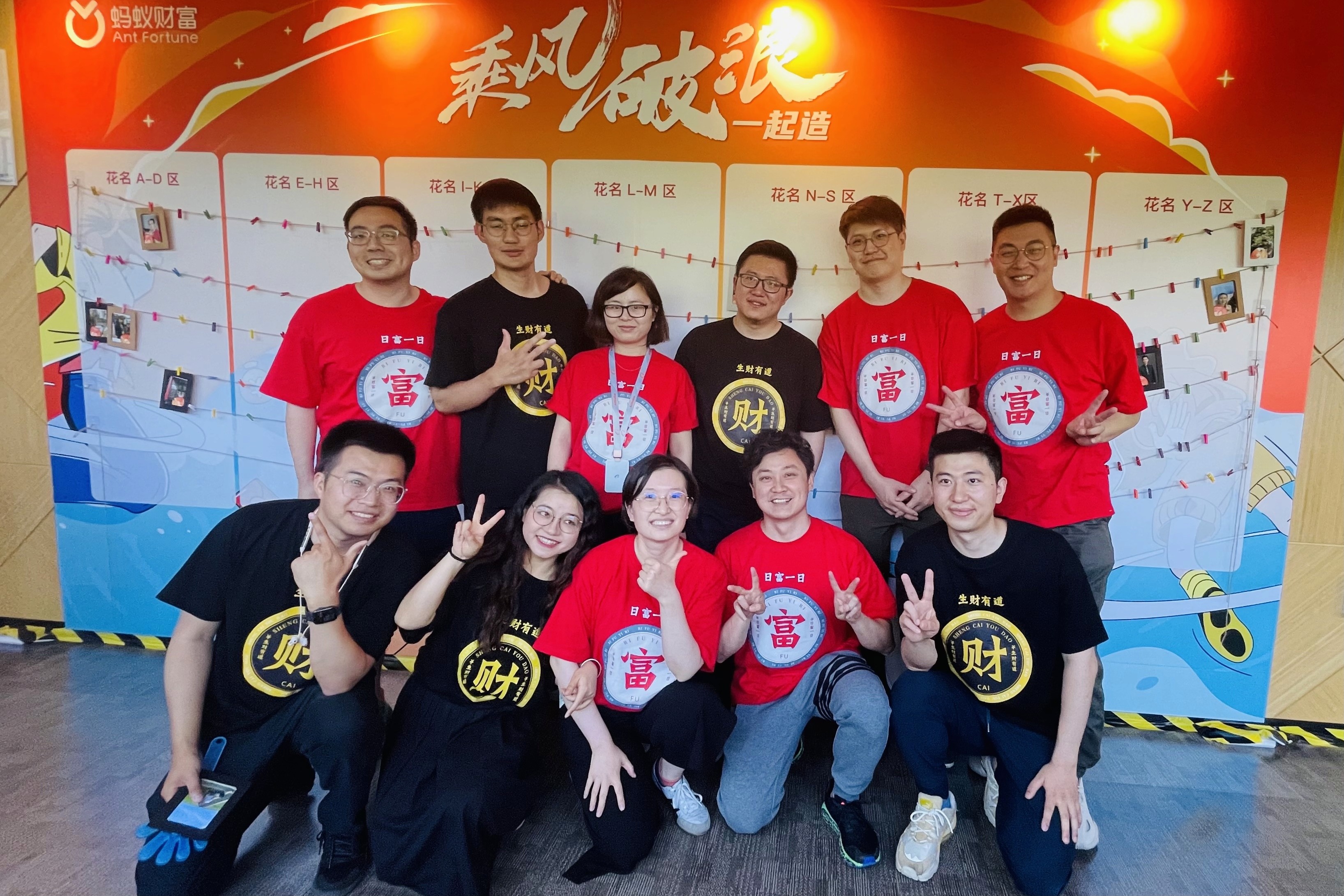
Me and my amazing team
thanks for stopping by;)
Handcrafted with